📒 Developer style guide for Alerts
Alert is one of the feature component for the web pages. This gives the sense of secure to the user while using the web-page. Sometime user accidenly come across some secure section. If some misconception have it will alert to the user about his action once confirmed it go ahead. It can be positive an negative both.
For some success result it will give the green alert. And for delete action it will give the red alert.
Types of Alert-Action
- Danger/Error (Red)
- Warning (Yellow/orange)
- Information (Blue)
- Success (Green)
General must known design system guideline :
Color 🎨
| Background | Border | Shadow | |
|---|---|---|---|
| General Alert | bg-zinc-100 | border-stone-300 | shadow-stone-300 |
| Information Alert | bg-blue-100 | border-blue-700 | shadow-blue-100 |
| Error Alert | bg-red-100 | border-red-600 | shadow-red-100 |
| Success Alert | bg-green-50 | border-emerald-300 | shadow-emerald-100 |
| Warning Alert | bg-orange-50 | border-orange-400 | shadow-orange-100 |
| Modern Alert | bg-indigo-900 | none | none |
Color of bg is generally used as shade of 100 / 700
Color of text will depend on the bg color
| Color | Text |
|---|---|
| Code in Tailwind | text-orange-500 text-green-500 text-blue-500 |
Note : Color of the text [color] will depend on the color of the background but here background and color of text should be matched.
Font
For all Alerts font is size: text-base
SVG And Path
SVG stands for Scalable Vector Graphic. It can be used to make graphics and animations like in HTML canvas. Path is always used within the svg tag to set the actual coordinate. Wihin the tag we give the some propety as what with be the co-ordinate, fill color, outer stroke, and some styling within class attribute.
Border Radius 🔲
The normal border-radius for the components are rounded-full. However this does not apply in many cases like buttons, input boxes and all.
Icon guidelines:
Mostly all the icons are taken from → Hero Icons (opens in a new tab)
Icon-text-gap : We follow a convention of equal margin between the text and the icon as padding in y axis py. and always the margin is given from the side of icon.
| Width | Type | |
|---|---|---|
| Small | w-4 & h-4 | Hero Icons mini |
| Medium | w-5 & h-5 | Hero Icons mini |
| Large | w-6 & h-6 | Hero Icons filled |
Example of simple Alerts component 👇
Want to see this Avatar in action? Try copy pasting this code in Tailwind Playground (opens in a new tab). 💥
<!--For danger -->
<div class="m-4 flex items-center rounded-2xl border border-solid border-red-500 bg-red-50 p-3">
<!-- Icon -->
<div class="pl-auto items-center justify-items-center pt-1">
<svg xmlns="http://www.w3.org/2000/svg" fill="none" viewBox="0 0 24 24" stroke="currentColor" class="h-6 w-6">
<path stroke="red" d="M18.364 18.364A9 9 0 005.636 5.636m12.728 12.728A9 9 0 015.636 5.636m12.728 12.728L5.636 5.636" />
</svg>
</div>
<!-- Text -->
<div class="ml-3 items-center justify-items-center font-sans text-base text-red-500">Williamsburg carles vegan helvetica</div>
<!-- Close button -->
<div class="ml-auto items-center justify-items-center">
<button type="button" class="ml-auto mt-auto h-5 w-5 items-center rounded-full border border-solid border-red-500 p-0.5 text-red-500">
<svg aria-hidden="true" fill="currentColor" viewBox="0 0 20 20" xmlns="http://www.w3.org/2000/svg">
<path d="M4.293 4.293a1 1 0 011.414 0L10 8.586l4.293-4.293a1 1 0 111.414 1.414L11.414 10l4.293 4.293a1 1 0 01-1.414 1.414L10 11.414l-4.293 4.293a1 1 0 01-1.414-1.414L8.586 10 4.293 5.707a1 1 0 010-1.414z"></path>
</svg>
</button>
</div>
</div>
<!-- For General -->
<div class="m-4 flex items-center rounded-2xl border border-solid border-black p-3 bg-gray-50">
<!-- Icon -->
<div class="pl-auto items-center justify-items-center">
<svg xmlns="http://www.w3.org/2000/svg" fill="none" viewBox="0 0 24 24" stroke-width="1.5" stroke="currentColor" class="h-6 w-6">
<path stroke-linecap="round" stroke-linejoin="round" d="M11.25 11.25l.041-.02a.75.75 0 011.063.852l-.708 2.836a.75.75 0 001.063.853l.041-.021M21 12a9 9 0 11-18 0 9 9 0 0118 0zm-9-3.75h.008v.008H12V8.25z" />
</svg>
</div>
<!-- Text -->
<div class="ml-3 items-center justify-items-center font-sans text-base text-black">Williamsburg carles vegan helvetica</div>
<!-- Close button -->
<div class="ml-auto items-center justify-items-center">
<button type="button" class="ml-auto mt-auto h-5 w-5 items-center rounded-full border border-solid border-black p-0.5 text-black">
<svg aria-hidden="true" fill="currentColor" viewBox="0 0 20 20" xmlns="http://www.w3.org/2000/svg">
<path d="M4.293 4.293a1 1 0 011.414 0L10 8.586l4.293-4.293a1 1 0 111.414 1.414L11.414 10l4.293 4.293a1 1 0 01-1.414 1.414L10 11.414l-4.293 4.293a1 1 0 01-1.414-1.414L8.586 10 4.293 5.707a1 1 0 010-1.414z"></path>
</svg>
</button>
</div>
</div>
<!-- For Info -->
<div class="m-4 flex items-center justify-center rounded-2xl border border-solid border-blue-600 bg-blue-50 p-3" role="alert">
<svg class="h-5 w-5 fill-current text-blue-600" viewBox="0 0 448 512">
<path d="M256 32V49.88C328.5 61.39 384 124.2 384 200V233.4C384 278.8 399.5 322.9 427.8 358.4L442.7 377C448.5 384.2 449.6 394.1 445.6 402.4C441.6 410.7 433.2 416 424 416H24C14.77 416 6.365 410.7 2.369 402.4C-1.628 394.1-.504 384.2 5.26 377L20.17 358.4C48.54 322.9 64 278.8 64 233.4V200C64 124.2 119.5 61.39 192 49.88V32C192 14.33 206.3 0 224 0C241.7 0 256 14.33 256 32V32zM216 96C158.6 96 112 142.6 112 200V233.4C112 281.3 98.12 328 72.31 368H375.7C349.9 328 336 281.3 336 233.4V200C336 142.6 289.4 96 232 96H216zM288 448C288 464.1 281.3 481.3 269.3 493.3C257.3 505.3 240.1 512 224 512C207 512 190.7 505.3 178.7 493.3C166.7 481.3 160 464.1 160 448H288z" />
</svg>
<div class="ml-3 font-sans text-base text-blue-600 dark:text-blue-600">Williamsburg carles vegan helvetica</div>
<button type="button" class="ml-auto inline-flex h-5 w-5 rounded-full border border-solid border-blue-600 p-0.5 text-blue-600" aria-label="Close">
<svg aria-hidden="true" fill="currentColor" viewBox="0 0 20 20" xmlns="http://www.w3.org/2000/svg">
<path d="M4.293 4.293a1 1 0 011.414 0L10 8.586l4.293-4.293a1 1 0 111.414 1.414L11.414 10l4.293 4.293a1 1 0 01-1.414 1.414L10 11.414l-4.293 4.293a1 1 0 01-1.414-1.414L8.586 10 4.293 5.707a1 1 0 010-1.414z"></path>
</svg>
</button>
</div>
<!-- For modern -->
<div class="bg-indigo-900 text-center py-4 lg:px-4">
<div
class="p-2 ml-5 mr-5 rounded-3xl cursor-pointer bg-indigo-800 items-center text-indigo-100 leading-none lg:rounded-full flex lg:inline-flex"
role="alert">
<span class="flex rounded-full bg-indigo-500 uppercase px-2 py-1 text-xs font-bold mr-3">New</span>
<span class="font-semibold mr-2 text-left flex-auto">Get the coolest t-shirts from our brand new store</span>
<svg class="fill-current opacity-75 h-4 w-4" xmlns="http://www.w3.org/2000/svg" viewBox="0 0 20 20">
<path d="M12.95 10.707l.707-.707L8 4.343 6.586 5.757 10.828 10l-4.242 4.243L8 15.657l4.95-4.95z" />
</svg>
</div>
</div>
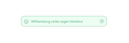
<!-- For success -->
<div class="m-4 flex items-center rounded-2xl border border-solid border-green-500 bg-green-50 p-3">
<!-- Icon -->
<div class="pl-auto">
<svg class="absolute h-5 w-6" xmlns="http://www.w3.org/2000/svg" fill="none" viewBox="0 0 27 27"><path fill="#3DBB77" fill-rule="evenodd" d="M13.129 2.342a11 11 0 1 0 11 11 1 1 0 0 1 2 0 13 13 0 1 1-6.5-11.26.999.999 0 1 1-1 1.73 10.944 10.944 0 0 0-5.5-1.47Z" clip-rule="evenodd" /></svg>
<svg class="ml-2 h-4 w-4" xmlns="http://www.w3.org/2000/svg" fill="none" viewBox="0 0 23 17"><path fill="#3DBB77" fill-rule="evenodd" d="M21.838.634a1 1 0 0 1 0 1.416l-14 14a1 1 0 0 1-1.416 0l-6-6a1.002 1.002 0 0 1 1.416-1.416l5.292 5.294L20.422.634a1 1 0 0 1 1.416 0Z" clip-rule="evenodd" /></svg>
</div>
<!-- Text -->
<div class="ml-3 items-center justify-items-center font-sans text-base text-green-500">Williamsburg carles vegan helvetica</div>
<!-- Close button -->
<div class="ml-auto items-center justify-items-center">
<button type="button" class="ml-auto mt-auto h-5 w-5 items-center rounded-full border border-solid border-green-500 p-0.5 text-green-500">
<svg aria-hidden="true" fill="currentColor" viewBox="0 0 20 20" xmlns="http://www.w3.org/2000/svg">
<path d="M4.293 4.293a1 1 0 011.414 0L10 8.586l4.293-4.293a1 1 0 111.414 1.414L11.414 10l4.293 4.293a1 1 0 01-1.414 1.414L10 11.414l-4.293 4.293a1 1 0 01-1.414-1.414L8.586 10 4.293 5.707a1 1 0 010-1.414z"></path>
</svg>
</button>
</div>
</div>
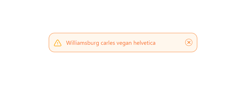
<!-- For warning -->
<div class="m-4 flex items-center rounded-2xl border border-solid border-orange-500 bg-orange-50 p-3">
<!-- Icon -->
<div class="pl-auto items-center justify-items-center pt-1">
<svg xmlns="http://www.w3.org/2000/svg" fill="none" viewBox="0 0 24 24" stroke-width="1.5" stroke="currentColor" class="h-6 w-6">
<path stroke="orange" stroke-linecap="round" stroke-linejoin="round" d="M12 9v3.75m-9.303 3.376c-.866 1.5.217 3.374 1.948 3.374h14.71c1.73 0 2.813-1.874 1.948-3.374L13.949 3.378c-.866-1.5-3.032-1.5-3.898 0L2.697 16.126zM12 15.75h.007v.008H12v-.008z" />
</svg>
</div>
<!-- Text -->
<div class="ml-3 items-center justify-items-center font-sans text-base text-orange-500">Williamsburg carles vegan helvetica</div>
<!-- Close button -->
<div class="ml-auto items-center justify-items-center">
<button type="button" class="ml-auto mt-auto h-5 w-5 items-center rounded-full border border-solid border-orange-500 p-0.5 text-orange-500">
<svg aria-hidden="true" fill="currentColor" viewBox="0 0 20 20" xmlns="http://www.w3.org/2000/svg">
<path d="M4.293 4.293a1 1 0 011.414 0L10 8.586l4.293-4.293a1 1 0 111.414 1.414L11.414 10l4.293 4.293a1 1 0 01-1.414 1.414L10 11.414l-4.293 4.293a1 1 0 01-1.414-1.414L8.586 10 4.293 5.707a1 1 0 010-1.414z"></path>
</svg>
</button>
</div>
</div>Having some problem ? 😕
If you still have a problem understanding this please join our discord server (opens in a new tab) to get help.