📒 Developer style guide for Accordion
Accordion is one of the cool GUI feature in website, that help website to behave more interactive to the users. It is list of item that vertically stacked.This control element allow to cover more content in less space".
Accordina works as something similar as menubar which will only main title to the user and underneath the title there will ecompose there respective content. Side by Side there will be the arrow down button when user click or hover it, Title get expend and now user is accessible with content. So, at the end accordian work on the collapse and expend feature.
General must known design system guideline :
Color 🎨
| Background | Border | |
|---|---|---|
| Light Theme | bg-gray-200 | border-gray-300 |
| Blue Theme | bg-blue-600 | none |
| Dark Theme | bg-slate-900 | none |
Color of text will depend on the bg color
| Background | Dark | Blue | Light |
|---|---|---|---|
| Code in Tailwind | text-white | text-slate-900 | text-black |
Note : Color of the text [color] will depend on the color of the background
Transition ( transition-all )
whenever there is a hover effect, one must use transition-all class with it.
Font
For all Accordion font is : Default font but can be optimise accordingly
Icon guidelines:
Mostly all the icons are taken from → Hero Icons (opens in a new tab)
Icon-text-gap : We follow a convention of equal margin between the text and the icon as padding in y axis py. and always the margin is given from the side of icon.
| Width | Type | |
|---|---|---|
| Small | w-4 & h-4 | Hero Icons mini |
| Medium | w-5 & h-5 | Hero Icons mini |
| Large | w-6 & h-6 | Hero Icons filled |
Hover Color
For all Breadcumbs component the hover color is hover:bg-blue-600.
SVG And Path
SVG stands for Scalable Vector Graphic. It can be used to make graphics and animations like in HTML canvas. Path is always used within the svg tag to set the actual coordinate. Wihin the tag we give the some propety as what with be the co-ordinate, fill color, outer stroke, and some styling within class attribute.
Border Radius 🔲
The normal border-radius for the components are rounded-md. However this does not apply in many cases like buttons, input boxes and all.
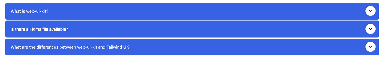
Example of simple Accordion component 👇
Want to see this Avatar in action? Try copy pasting this code in Tailwind Playground (opens in a new tab). 💥
<!-- Accordion-0 -->

<div class="p-5 bg-blue-600">
  <div class="relative my-1">
    <input type="checkbox" class="peer absolute left-0 top-0 h-16 w-full cursor-pointer bg-red-300 p-5 opacity-0" />
    <div class="cursor-pointer rounded-md bg-white p-5">What is web-ui-kit?</div>
    <div
      class="absolute right-3 top-3 rounded-full border p-2 shadow-md duration-500 rotate-90 peer-checked:-rotate-90 peer-checked:rounded-full peer-checked:bg-blue-500 peer-checked:text-white peer-checked:transition-all peer-checked:duration-500">
      <svg xmlns="http://www.w3.org/2000/svg" fill="none" viewBox="0 0 24 24" stroke-width="1.5" stroke="currentColor"
        class="w-5">
        <path stroke-linecap="round" stroke-linejoin="round" d="M8.25 4.5l7.5 7.5-7.5 7.5" />
      </svg>
    </div>
    <div class="max-h-0 overflow-hidden transition-all duration-500 peer-checked:max-h-screen">
      <p class="p-4 text-white">web-ui-kit is an open-source library of interactive components built on top of Tailwind
        CSS including buttons, dropdowns, modals, navbars, and more.</p>
    </div>
  </div>

  <div class="relative my-1">
    <input type="checkbox" class="peer absolute left-0 top-0 h-16 w-full cursor-pointer bg-red-300 p-5 opacity-0" />
    <div class="cursor-pointer rounded-md bg-white p-5 pr-10">Is there a Figma file available?</div>
    <div
      class="absolute right-3 top-3 rounded-full border p-2 shadow-md duration-500 rotate-90 peer-checked:-rotate-90 peer-checked:rounded-full peer-checked:bg-blue-500 peer-checked:text-white peer-checked:transition-all peer-checked:duration-500">
      <svg xmlns="http://www.w3.org/2000/svg" fill="none" viewBox="0 0 24 24" stroke-width="1.5" stroke="currentColor"
        class="w-5">
        <path stroke-linecap="round" stroke-linejoin="round" d="M8.25 4.5l7.5 7.5-7.5 7.5" />
      </svg>
    </div>
    <div class="max-h-0 overflow-hidden transition-all duration-500 peer-checked:max-h-screen">
      <p class="p-4 text-white">web-ui-kit is first conceptualized and designed using the Figma software so everything
        you see in the library has a design equivalent in our Figma file.</p>
      <p class="p-4 text-white">Check out the <a href="https://clueless.tech" class="underline">Figma design system</a>
        based on the utility classes from Tailwind CSS and components from web-ui-kit.</p>
    </div>
  </div>
  <div class="relative my-1">
    <input type="checkbox" class="peer absolute left-0 top-0 h-16 w-full cursor-pointer bg-red-300 p-5 opacity-0" />
    <div class="cursor-pointer rounded-md bg-white p-5 pr-14">What are the differences between web-ui-kit and Tailwind
      UI?</div>
    <div
      class="absolute right-3 top-3 rounded-full border p-2 shadow-md duration-500 rotate-90 peer-checked:-rotate-90 peer-checked:rounded-full peer-checked:bg-blue-500 peer-checked:text-white peer-checked:transition-all peer-checked:duration-500">
      <svg xmlns="http://www.w3.org/2000/svg" fill="none" viewBox="0 0 24 24" stroke-width="1.5" stroke="currentColor"
        class="w-5">
        <path stroke-linecap="round" stroke-linejoin="round" d="M8.25 4.5l7.5 7.5-7.5 7.5" />
      </svg>
    </div>
    <div class="max-h-0 overflow-hidden transition-all duration-500 peer-checked:max-h-screen">
      <p class="p-4 text-white">The main difference is that the core components from web-ui-kit are open source under
        the MIT license, whereas Tailwind UI is a paid product. Another difference is that web-ui-kit relies on smaller
        and standalone components, whereas Tailwind UI offers sections of pages.</p>
      <p class="p-4 text-white">However, we actually recommend using both web-ui-kit, web-ui-kit Pro, and even Tailwind
        UI as there is no technical reason stopping you from using the best of two worlds.</p>
    </div>
  </div>
</div>
Having some problem ? 😕
If you still have a problem understanding this please join our discord server (opens in a new tab) to get help.